Web design – Vavřík Studio
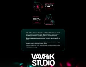
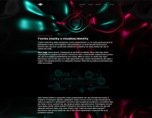
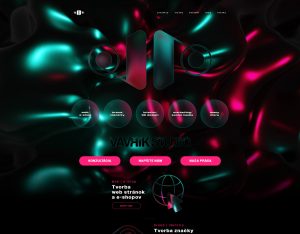
Our website was designed as a natural extension of the Vavřík Studio brand identity. It combines a clean, minimalist layout with bold colours and visuals that reflect our creativity. The information architecture intuitively guides visitors through our services, portfolio, and pricing, resulting in a memorable presentation with clear navigation and a consistent visual identity.

Web redesign – NuPhoenix
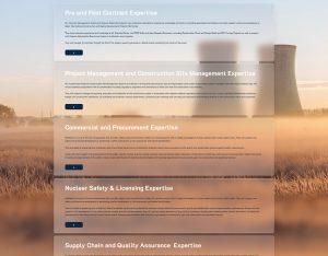
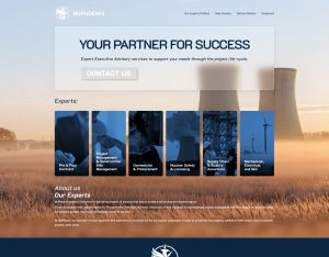
For the UK-based company NuPhoenix, we redesigned a website that was previously limited by a template-based platform. The project included migrating the domain, hosting, and email services to WordPress. The new design was built around credibility, expertise, and a clear user experience, ensuring the website reflects the integrator's role in delivering complex megaprojects.

Web design – case study
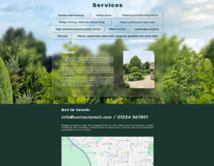
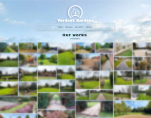
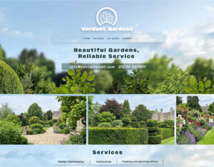
The goal of this landing page was to create the feeling of stepping directly into a garden. Large project photography, a natural colour palette, and an open layout highlight the company's craftsmanship and outdoor expertise. The content is organised by services and supported by clear contact elements, allowing visitors to quickly navigate and find the information they need.

Interior design – Reset Therapy
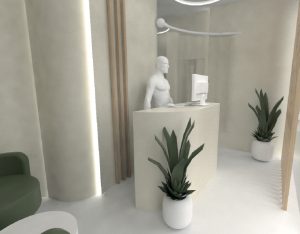
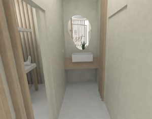
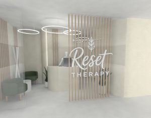
This interior design project for a longevity and biohacking studio focused on making the most of a compact space. Despite the limited floor plan, we incorporated a reception area, hallway, and three therapy rooms. Soft curves, organic shapes, subtle colours, and circular lighting create a calm atmosphere that promotes relaxation while visually expanding the interior.

Brand identity – Vavrik Studio
The Vavřík Studio brand identity was created by combining two perspectives: design and brand communication. The studio's name carries the founder's surname as a symbol of craftsmanship driven by results. The logo merges the founders' initials to represent perspective, growth, and reflection. This dynamic visual system extends to the website, where animated backgrounds symbolise continuous creativity, progress, and evolution.

Logo – case study
The logo was created as a visual fusion of the brand's three key symbols. The initials M and W are combined with the silhouette of a roof and a circular saw blade, referencing the company's carpentry craftsmanship and expertise in working with wood. The result is a simple yet distinctive symbol that communicates professionalism, precision, and the character of the company through a single, memorable graphic element.

Logo – case study
The visual identity of the architectural studio is inspired by elements of technical drawings and architectural documentation. The logo combines a detail marker commonly used in construction plans, floor plan hatch patterns, the silhouette of a house, and a portion of the studio's name. By bringing these elements together, the identity naturally reflects the studio's technical precision, attention to detail, and architectural expertise.